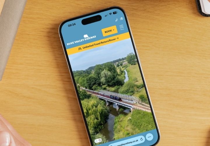
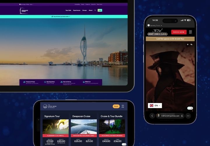
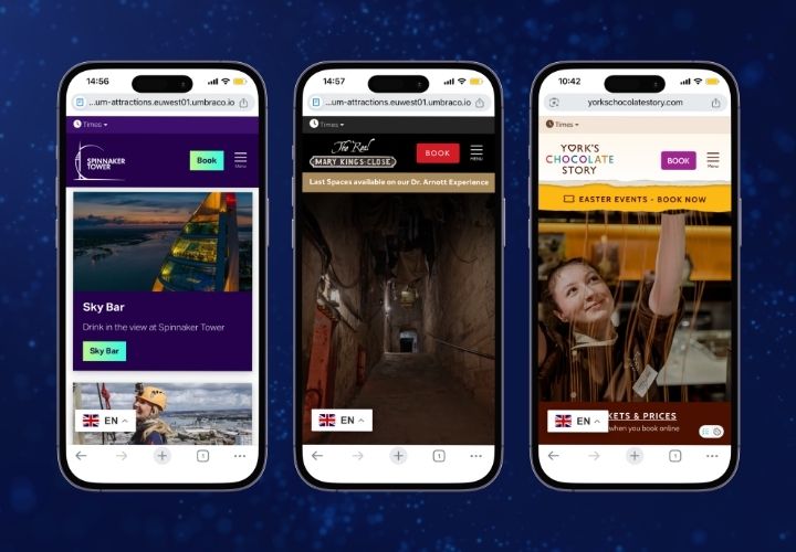
When a potential guest visits your website it is unlikely that they give any consideration of the moving parts or complexities involved in providing this fantastic first impression. After all, it's what we have come to expect from websites and mobile apps, whether booking a flight, arranging a food delivery or visiting the gym.
However, what we do remember is when that first, online impression is poor. It sets an expectation of what is to follow, the anticipation of what that fantastic day out will ential. The virtual equivalent of an overgrown garden and peeling paintwork. We immediately gather an opinion of what lurks behind the front door.
First impressions last.
Bringing your brand to life online
So, it is not surprising that we spend so much of our time and marketing budgets on the appearance of our websites, making sure they are “on brand”, of modern design and built for mobile. But even if you have achieved this, it is just the beginning.
Creative design and fantastic imagery are important, of course, but even more so is website usability, navigation and a seamless visitor experience that takes effortlessly to our desired outcome.
Mobile first and WCAG compliant accessibility are a given these days, but you also need to consider the baseline functionality that visitors require; - Opening Times, Events Calendar, Newsletter Sign Ups, Memberships, Virtual Site Map, News Feeds, FAQ’s / Help Centre and many more essential features that are mandatory across every visitor attraction digital site..
Why do we spend so much time designing all of these features from scratch when they can be provided out of the box, ready for your unique branding and designs?
Keeping things simple
Most smaller visitor attractions simply don't have the time or budget to take this ground up approach, particularly when there are exquisite alternatives available, offering a 5 Star website platform ready for you to add your unique form of magic. The value add aspects of your site are your brand, designs and content.
Let LOOP take care of the heavy lifting, and invest your time and energies in optimising SEO, clear navigation and calls to action and maximising conversions.
Build, measure, learn
For the majority of venues or events this typically entails some form of participation or purchase action. Essentially, it involves an online booking or retail transaction with the expectation that these steps will be successfully completed and a purchase is made.
According to Graham Charlton of Sales Cycle - “Easy navigation on mobile, clear product images & copy, and a simplified checkout process helps to attract and convert mobile visitors”.
We refer to this as Conversion Rate Optimisation (CRO) and this is where attractions need to invest their efforts because it has a direct impact on our revenues.
Typically traffic from mobile phones is at least 70-80% of your visitors, compared to 15% for desktop. However, this mobile traffic is converting at less than half the rate of that of desktop computers, at 2.25% compared to 4.81% for desktop mainly due to poor navigation, complex purchase journeys and complex checkout.
All they see is a clunky, difficult process, particularly when attempted from their mobile phone and between 95.19% and 97.75% give up before they complete their transaction. Of course, we all have browsing and information gathering visitors on our sites, not everyone is a purchaser, but if we deploy our analytics correctly we can ensure that traffic, page visits and site dwell times are growing whilst keeping our main focus on conversions.
Remember this week's research is next week's booking.
Semantic has been building visitor attraction websites for 20 years and knows exactly how to deliver the building blocks and a compelling “WOW factor” design. We have spent years optimising the core features, providing easy to administer CMS and most importantly we know how to fit together these component parts.
We understand deep linking eCommerce journeys that make all the difference in delivering a smooth process and maximising conversion rates and revenues.
Covid-19 may have been the catalyst for the uptick in pre-booking and planning our day out, which has benefitted the visitor and organiser alike. The pendulum may have partially swung back and last minute bookings are on the up, but what is in no doubt whatsoever is the amount of research the average visitor carries out ahead of their visit.
According to VisitBritain, during the pandemic we all invested more in our digital presence, but have we done this in a sustainable manner? Have we blown our entire digital budget on a fantastic new site only to find it is difficult to add content or that it doesn’t convert?
A website is not just for Christmas! It is an essential, living, breathing tool. We cut our lawns every week, we put petrol in our car, we clean and decorate our houses, We should take the same level of care with our primary marketing tool.
