Landing pages are critical in converting site traffic into tangible actions such as ticket purchases or newsletter sign-ups.
A well-designed landing page can significantly boost conversions by providing a clear and compelling call to action. Here’s how you can create effective landing pages to drive traffic and increase conversions for your attraction.
Common Mistakes to Avoid
- Unclear Call-to-Action (CTA): Without a strong and clear CTA, visitors may not know what action to take, leading to inaction and lost opportunities.
- Non-targeted page content: If images, copy, videos or information are targeting the wrong audience for a given ad or campaign then the bounce rate will be high and guests may get confused.
- Content Overload: Overloading pages with too much information can overwhelm visitors and dilute the main message, causing them to leave without taking action.
- Poor User Experience: A clunky design, slow load times, and non-responsive layouts can drive potential customers away, resulting in high bounce rates.
- Lack of Testing: Not testing different versions of landing pages can mean missing out on opportunities to optimise and improve conversion rates.
Recommendations for Effective Landing Pages
- Clear and Compelling CTAs: Ensure your CTAs are prominent, engaging, and use action-oriented text. They should guide visitors towards the desired action effortlessly.
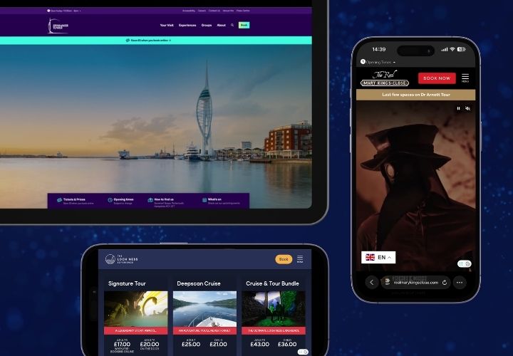
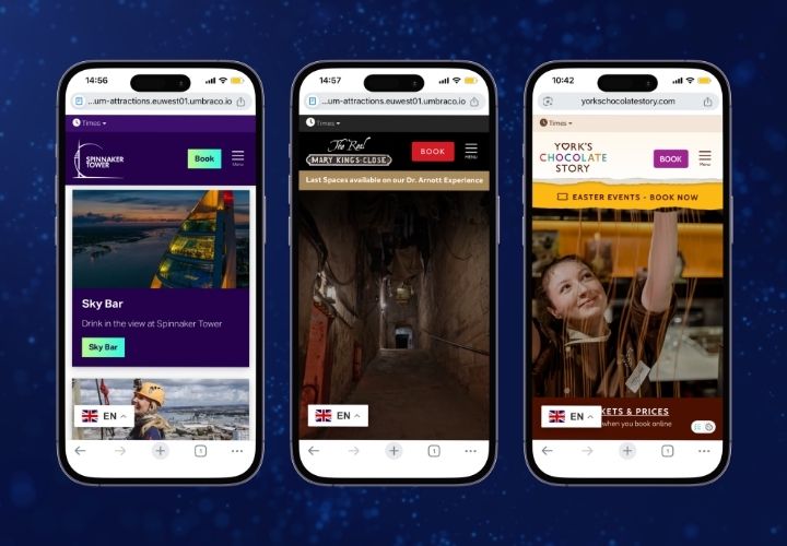
- Target landing pages to key audiences: deliver a better, more tailored guest experience so that it’s easier for them to decide to visit.
- Focus on Key Information: Keep content concise and to the point. Emphasise the benefits and what the visitor will gain from taking the desired action.
- Optimise for Performance: Ensure your landing pages load quickly and are optimised for mobile devices. A seamless experience keeps visitors engaged and reduces drop-offs.
- Continuous A/B Testing: Regularly test different elements of your landing pages (like headlines, images, and CTAs) to identify the most effective configurations and improve conversion rates.
Detailed Breakdown
1. Clear and Compelling CTAs: Driving Action
Your call-to-action is the most crucial element of your landing page. It should be designed to stand out and prompt immediate action.
- Action-Oriented Text: Use verbs that encourage action such as “Book Now,” “Get Tickets,” or “Sign Up Today.”
- Visibility: Place your CTA above the fold, ensuring visitors see it without having to scroll down. Use contrasting colours to make it stand out.

2. Target landing pages to key audiences
It’s key to make sure your ads and landing pages are aligned. You ideally need a different landing page for each campaign demographic or type of campaign.
- More is more: It’s better to have more landing pages that are more targeted to particular customer demographics - maybe there’s an opportunity to better target fans or enthusiasts, or something that would resonate more with parents & toddlers.
- Share key information and content: Make sure your CMS can share key information like open times, maps and FAQs across multiple pages. If you get that in place, then it’s easy to create 10 or 20 targeted landing pages, just with new intros and a few different sections, knowing that the core info will always be accurate
If you have a post or campaign that’s just linking to your homepage, then most of the time, a targeted landing page will be able to deliver a more joined-up personalised experience.
3. Focus on Key Information: Less is More
Visitors should be able to quickly understand what you’re offering and why they should be interested.
- Concise Content: Avoid overwhelming visitors with too much information. Use bullet points and short paragraphs to convey key points succinctly.
- Emphasise Benefits: Highlight what the visitor will gain by taking the action. Whether it’s a discount, an exclusive experience, or a time-saving benefit, make it clear.

4. Optimise for Performance: Speed and Responsiveness
A slow-loading or poorly designed landing page can turn visitors away before they even see your offer.
- Fast Load Times: Compress images and use efficient coding to ensure your landing page loads quickly. Use tools like Google PageSpeed Insights to identify and fix performance issues.
- Mobile Optimisation: Ensure your landing page is fully responsive and looks great on all devices. A significant portion of web traffic comes from mobile users, so a mobile-friendly design is essential.
5. Continuous A/B Testing: Improve Through Experimentation
Testing different elements of your landing page can provide insights into what works best to convert visitors.
- Test Headlines: Experiment with different headlines to see which ones grab attention and encourage engagement.
- Test Images: Use different images to see which ones resonate more with your audience and enhance the message.
- Test CTAs: Try different wording, colours, and placements for your CTAs to find the most effective combination.

Next Steps for High-Converting Landing Pages
- Design with Purpose: Create landing pages with the primary focus on converting visitors through clear and compelling CTAs. Ensure every element supports this goal.
- Implement A/B Testing: Regularly test different page elements to identify the most effective configurations. Use tools like Zoho Pagesense or Optimizely to facilitate this process.
- Monitor and Analyse: Use analytics tools to track visitor interactions on your landing pages. Analyse the data to make informed, data-driven decisions to continually improve performance.
Creating high-converting landing pages is essential for turning site traffic into valuable actions.
By avoiding common pitfalls, focusing on clear and compelling CTAs, keeping content concise, optimising for performance, and continually testing different elements, you can significantly boost your attraction’s conversions.
Remember, the goal is to provide a seamless and engaging experience that guides visitors towards visiting your venue or booking tickets.
Not sure where to start - download the LOOP Website Optimisation Canvas or get in touch and we’ll be happy to help.
