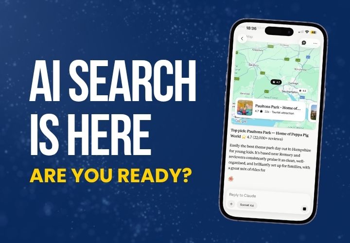


Across multiple user testing sessions and visitor surveys, a clear pattern has emerged: even highly motivated visitors can become confused or frustrated by unclear messaging or overly complex booking journeys. These blockers not only disrupt the experience but can lead to missed bookings and unnecessary enquiries.
In this post we’ll be focusing on the ticketing and booking flow - the part of the journey where users move from interest to action. Most of the issues uncovered stem from content clarity and information, structural gaps, and third-party system friction.
Here's what we've learned from real users and how you can improve their booking journey.
1. Unclear Pricing and Ticket Options
Many visitors struggle to find definitive pricing early in the journey or don’t fully understand what’s included. Confusion arises from vague terms like “from £X” or ticket types that aren’t explained in plain language. Family, group, and member options are especially prone to misinterpretation.
What users said:
- “I thought I’d found the price but then it changed when I clicked to book.”
- “I couldn’t tell what was included in my pass.”
- “No clear mention of senior discounts or over-60s pricing.”
How to fix it: Clear and consistent pricing is one of the most important ways to build trust and reduce user hesitation. Many of the frustrations we saw could be avoided by making pricing information more accessible and self-explanatory.
Here are some simple but effective ways to do that:
- Add a prominent pricing panel to key landing pages (not just the ticketing page).
- Include a full breakdown of ticket types, age brackets, and discount rules.
- Use simple language and visual cues (e.g. icons or badges) to flag inclusions and extras.
- Provide real-world examples like: "A family of 4 would pay £X total" to help users self-identify.
- Ensure price consistency from homepage to final booking step to reduce surprises.
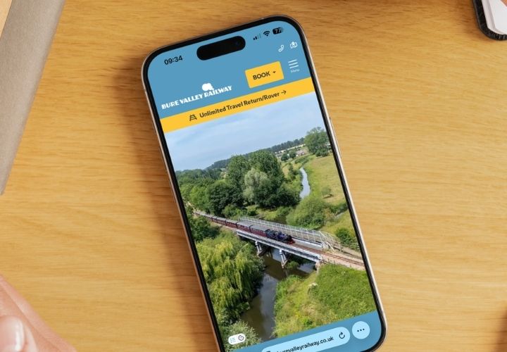
2. Confusing Booking Journeys
The problem: For many users, the booking journey becomes confusing once they’re taken to a third-party or subdomain booking platform. Users often encounter unclear ticket types, no contextual guidance, or are unsure how to proceed. In many cases, they give up or call instead.
What users said:
- “I had to ring you because I couldn’t figure out the member parking.”
- “Didn’t know if I needed to pick a time slot or not.”
- “It wasn’t clear what I was booking until the very end.”
How to fix it: The booking journey should feel like a guided, step-by-step path — not a drop-off cliff. When the experience moves between systems or lacks signposting, users are far more likely to abandon it.
To help keep users confident and on track:
- Add clear CTAs and descriptive text before directing users to a third-party system.
- Include a booking checklist ("You'll need: number of guests, date, time slot") upfront.
- Reinforce ticket content visually during the process — e.g. “Includes access to all attractions + animal feeding.”
- Ensure each step in the journey (e.g. Choose Date → Choose Tickets → Confirm Details → Payment) is clearly labelled so users feel oriented.
- Where possible, embed help or a tooltip system within the booking interface.
3. What’s Included? Users Aren’t Sure
The problem: When attractions run seasonal events or bundle different experiences, users often can’t tell what’s part of their standard ticket. This leads to unnecessary hesitation or incorrect assumptions.
What users said:
- “Wasn’t sure if the special events were included or needed a separate ticket.”
- “Are all the animals available every day?”
How to fix it: A lack of clarity around what a ticket includes causes friction and indecision. The more transparently you communicate what's included (and what isn’t) during the booking process, the less chance users will second-guess their purchase.
Some effective solutions include:
- Use a simple visual label (e.g. ✔ Included or ✚ Add-on) across the site and in the booking system.
- List clearly what your standard ticket includes and what’s optional, especially on event pages.
- Clarify any seasonal variations in opening times or availability.
- Offer a "What's included?" summary panel during the booking process.
- Add a section to your FAQs addressing the most common misunderstandings.
4. Scattered Information for Planning a Visit
The problem: Visitors often want to quickly check parking info, accessibility, opening hours, or group visit policies — but this info is often buried across multiple pages or hidden behind PDFs.
What users said:
- “I couldn’t find info about group entry times.”
- “Had to click around to find accessibility details.”
How to fix it: Practical visit information should be effortless to find. When it's scattered across multiple locations or formatted inconsistently, users feel lost or frustrated.
Here's how to make planning easier and more reassuring for users:
- Create a dedicated "Plan Your Visit" or "Need to Know" section — one page to rule them all.
- Use accordion dropdowns to keep content digestible.
- Add a mini-nav or quick links bar on relevant pages pointing to FAQs, directions, and amenities.
- Include planning guidance within confirmation emails and post-booking pages.
5. Not Enough Support at Key Moments
The problem: When users feel unsure, there’s often no visible way to get help — no FAQ, no chat, and no reassurance. Even small uncertainties can cause drop-off.
What users said:
- “I clicked confirm but didn’t know if it had gone through properly.”
- “I couldn’t find an answer so I just gave up.”
How to fix it: In the absence of timely support or reassurance, doubt creeps in — and users hesitate or abandon the process. Offering the right help in the right place can have a significant impact on conversion.
To provide better support and reassurance throughout the journey:
- Add inline FAQs within the booking journey that answer common questions (“What if I don’t get a confirmation email?”).
- Use expandable help links or hover tips for terms like “Pass,” “Time slot,” or “Voucher.”
- Clearly display contact options, including expected response time.
- Include reassurance messaging after booking, such as a success screen with next steps and answers to “What happens now?”
- Consider a help widget or feedback link specifically for the booking path.
These blockers arise from messaging gaps and journeys that assume too much prior knowledge. By surfacing key details earlier and structuring content around user intent, attraction websites can deliver a smoother, more confident path to booking.
With LOOP, many of these improvements can be implemented quickly using reusable blocks, custom widgets, and integrated content areas — giving your team full control over the visitor experience without compromising flexibility.
If you'd like help or more information about how LOOP can bring your brand to life online, just get in touch for a free discovery session (or just a chat!).